(From Facebook Marketing Expert, Mari Smith's newsletter)
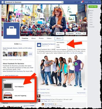
Facebook just announced that Pages are about to get a whole new look. Mostly, the changes make Pages now appear in the same design as our personal profiles. Here’s what to expect:
* Your Page wall posts will now be displayed inone single column (phew, good news here - this is much easier to read and follow. However, we won’t be able to feature content, such as images, in that nice double-wide view).
* The row of four tab thumbnails at the top are going away - ugh. There’s been some confusion about this at first. App tabs appear under a “More” tab (just like Profiles) + the app thumbnails also appear on the left column a little further down.
* Details about your business (aka the About section) + photos and videos will appear in a narrower left column.
NOTE: You may need to make adjustments to your Page Cover Image, as the name and category appear right on the image in white text and your profile picture will sit a bit higher in the new design. The actual dimensions remain the same, which are 851px by 315px.


No comments:
Post a Comment